Sydney Migraine
By ANNIE GODFREY
There are two ways of getting a high Green Star rating. One is to build a sustainable building. The other is to spend large amounts of money on green technology and expensive materials with a very high embodied carbon, to compensate for bad design. The new Sydney Modern, which is unquestionably the worst building ever designed by the architects SAANA, and the worst public building in Sydney, does the latter, squandering a lot of its 366 million spend of public funds.

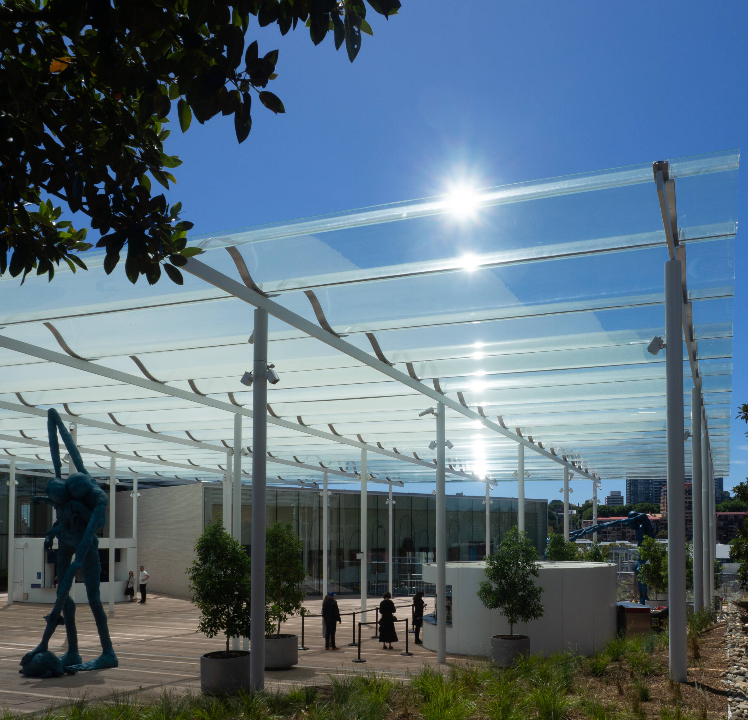
Entry logia, Sydney Modern. Photograph by Ann Godfrey
Facing north is a glass wall without overhang- inexcusable in Australia – which ignores lessons from the architectural greats, such as Louis Kahn and Rafael Moneo, on how to admit indirect natural light into gallery space. Inexplicably the entry logia has an undulating glass roof, glinting and blinding those who approach, even after it will have accumulated crud and leaves, and requiring that large sums of public money be wasted on special glass to prevent it from becoming a solar cooker, There is no shade, no cool respite, no relief. Everywhere is white steel and glass, collecting dirt and dust, and requiring a large amount of public money be spent to be kept anything like clean.
The aesthetic? At best it is glass box in the soul less, place less, international style that Kenneth Frampton’s Critical Regionalism decries. There are no references to Australian vernacular, none to the Sydney Sandstone next door, none to the gracious buildings on nearby Macquarie Street, and none to the Woollomooloo wharf it overlooks, other than to the large, white, fuel guzzling, look-at-how-much-I-cost yachts floating nearby. At worst it is a discordant, hodgepodge, of glary shimmering shapes and a migraine scotoma.
Sydney Modern conceptually flawed in design
By Dr PHILIP DREW
Sydney Modern has taken three, compared to the thirteen years for the Sydney Opera House. In their account, ‘A thoroughly modern very Sydney tale’ Good Weekend, 29 Oct, journalists Katrina Strickland and Linda Morris outline the determination, obstacles, and sometime conflicts, that were encountered. What is missing is any attempt to understand the flawed premise that underpins its design the pavilion. The gallery, of which the art gallery is a specific specialised variation, beginning in Rome as a sheltered outdoor walking space for displaying collections of antique sculpture, is a much better and functionally appropriate model. In Renaissance France, and more widely the north and England, galleries arose as narrow enclosed hall like spaces with paintings hung on one wall, illuminated by facing windows on the other in which people strolled and chatted in all weathers. The 94-year-old modern ‘pavilion’ is something altogether different, and is best exemplified by Mies van der Rohe’s National Gallery of Art, Berlin to which Sydney Modern bears a canny if poor resemblance in terms of its execution and crude details. The Miesian pavilion took its inspiration as an updated version in steel and glass of the Greek temple whose sole purpose was as a magnificently refined container for a sacred statuary. The Berlin galley was a failure as a space for exhibiting art. Mies acknowledged his error and ensured there were usable spaces for displaying art in the basement. Unfortunately SANAA have not—the only comparable refuge for art at Sydney Modern is a converted WW2 oil storage tank, the ‘Tank’, also in a basement!

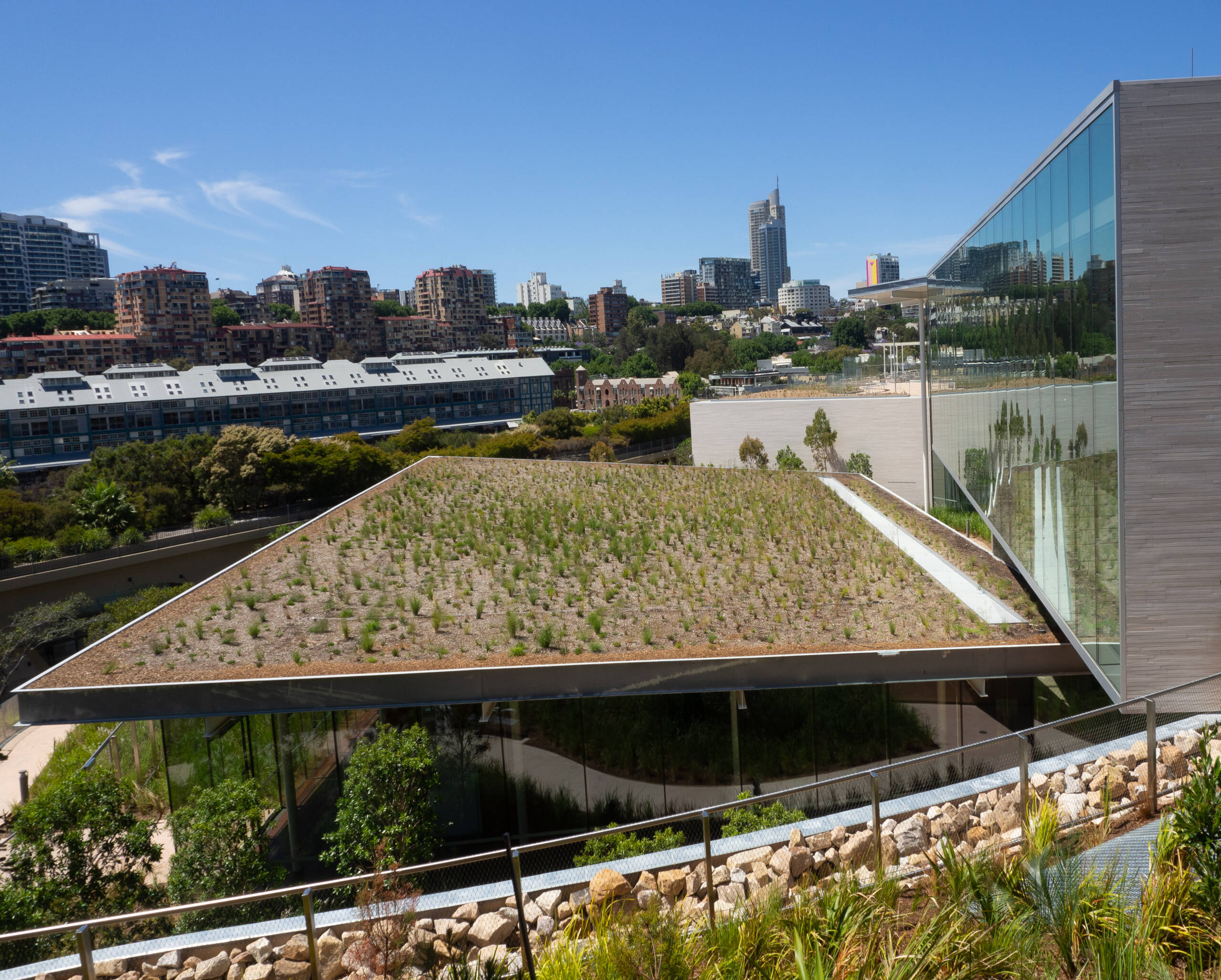
Rooftop, Sydney Modern. Photograph by Ann Godfrey
The modest humanity of Jorgen Bo & Wilhelm Wohlert’s 1958 Louisiana Museum at Humleæk, Denmark, or a version of it, would have suited Sydney far better than SANA’s four incongruous exposed pavilions, flowing with the site contours instead of attacking them, whilst avoiding the climatic inconsistency of glass pavilions. Louisiana applied the gallery typology with genius as a place for relaxed strolling open to views of its Ore Sund seascape. Sydney Modern is profoundly mistaken climatically as well as conceptually. Like its predecessor, the National Gallery of Art in Berlin, at best shows a token regard for its purpose, to display ‘Art’, at worst, it strives to overpower its art contents, and instead, pushes itself forward as the sole object worthy of our attention.
Dr Philip Drew is a Sydney-based architectural historian, critic and widely published author
The contributions above were received following Judith White’s post ‘Sydney Modern: the ultimate cultural cringe’ which can be read in full HERE.


It looks like the exercise yard of Long Bay Gaol.
Right on, thank you Culture Heist !
You-all have written what is self evidently true, and few are willing to say.
This building continues all the architectural blunders of the extension to the AGNSW done in the late 1980’s.
Like … Noisy mall type escalators, expansive architectural volumes providing no curatorial benefits.
Like … Walls of plate glass that offer no protection the blinding UV light of NSW to paintings, drawings, and prints.
Like … Expensive and charming architectural details that fail to serve the larger community of art in Australia
Like … Attempting to intimidate, and increase the insecurity of the Australian art community by importing largely derivative international contemporary art i.e. paintings by Stanley Whitney etc.
There is nearly complete absence of galleries for exhibiting relics of Australian expression.
It would be better to dismantle this luxurious edifice and reconstruct the building at the West Sydney Airport for service as an international passenger pavilion.
If this building is significant work of architecture, then the Darling Harbor facility must equal in quality to the Parthenon.
Just visited the new Gallery today. So very very sad to witness this horrible place. It does not welcome you as a finely constructed building should do. It is extremely ugly and poorly constructed.
Loved the art of the First Nations People. Best I have ever seen. The Art so deserves a much better place than this glass and steel soulless construction.